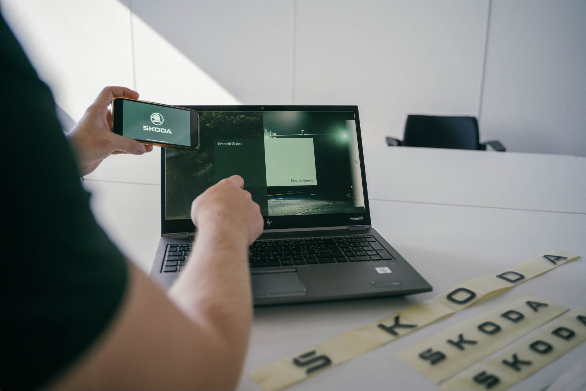
Skoda are introducing the brand’s biggest change in over 30 years which comes in the form of new design language for the cars and the logo itself! A major driving force behind this change came from Skoda’s ‘Next Level Skoda Strategy 2030‘ which directs the manufacturer towards a future of electrification and digitalisation.
The logo is more frequently seen on digital platforms so it has been redesigned in a two dimensional format to make it easier to recognise on both digital and print media. The biggest change is that the logo is now in full typographic characters which means ‘Skoda’ will be spelt out on both the front and rear of the cars. The traditional logo hasn’t been lost though, with its use being more selective.

The ‘S’ in Skoda has also been given a new look with the “hook” now integrated into the letter. Using a combination of symmetry as well as curves and edges to create the best result for all markets. Two new shades of green, ’emerald’ and ‘electric green’ have also been chosen as the brands colours.

Although the team working on this project was small, they received 165 submissions from across the company and the entire process took more than a year! The shortlisted logos and colours were then tested across 6 markets with more than 2,200 people being surveyed. All this change isn’t coming at once though with Skoda choosing to introduce the new logo gradually. First, the communications, then the tech and finally on the cars in 2024!
Thanks for reading! For more Skoda news and reviews visit Tarmac Life.
Pictures courtesy of Skoda Storyboard, words by Matthew D’Souza


