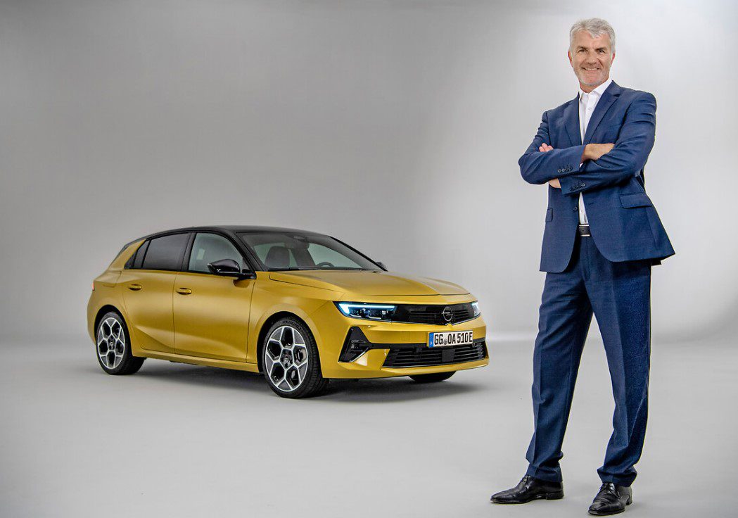
We talk to Mark Adams, Vice President Design Opel/Vauxhall about the new design direction he is taking German brand Opel in and why he’s so excited about it.
Mark Adams started his career at Opel/Vauxhall in 2002 as head of exterior development for concept and production vehicles. His first project was the Insignia concept and following production model. In 2007 he was named vice president for design, and he has led development of vehicles including the Astra GTC, the second-generation Insignia, 2013 Monza Concept and the 2016 GT Concept. Adams holds a bachelor’s degree in mechanical engineering and a master’s degree in automotive design from the Royal College of Art in London
Where are you getting your inspiration, what’s driving the new design language?
Let me take you back a few years so you understand the process we went through. The real big trigger in all honesty was the change in company [ownership]. Prior to when we became part of PSA and subsequently Stellantis, our designs were also twinned with Buick. So you might recognise new Holdens that looked like the Insignia or the Buick’s in China that look like the previous generation Mokka. So we had a few handcuffs that didn’t allow us to do what we wanted to do as an individual brand. That’s no disrespect to GM, we made it work but it was a restriction.
So when we came part of the PSA group we had the opportunity to be who we wanted to be and the key thing was we are the only German brand (and British in terms of Vauhall) within the overall portfolio and that remains true with Stellantis and that is a very distinctive position within the group. And the other thing Carlos (Tavares) personally said to me, ‘now you’ve got the freedom to define the brand from a design perspective’.
I told my team that we really have the chance to push the reset button. Let’s step back and start from basics, let’s not start from where we were, let’s go back and think about what the brand wants to be and how do we visually communicate those brand values, that’s true to be German etc.
So we started with the real basics and that is what I call the ‘drum beat’ philosophy and that’s what we build everything around. We spent a lot of time as a design team talking about what is German design, what does it mean and not just from a product perspective because there’s a lot of stereotypes that tend to automatically come up, quality, refinement all of those things, but we see that there’s a much newer modern German twist happening. Because Germany is not all schnitzel and open sandals, there’s a much more progressive side of Germany and a much more youthful side and we wanted to align ourselves as a brand with that.
So we came up with two words in the end, Bold and Pure. And that’s a little bit like sweet and sour, they’re a little bit contradictory but at the same time when together, they work in a strong way. Obviously we want to stand out, we don’t want to just be part of a mix and be like everyone else, we wanted to have some distinctiveness but this purity was very important to us. So not creating distinctiveness by doing tons of lines on the car, it needed to be done in a very coherent, well-structured way, again a very German way.
So that was our starting point and the two big things we then worked on was the face of the car, that’s the face of the brand. When you see the car coming down the road or parked on your driveway the face of the brand is very important. So we did a lot of sketch work around that, and I let the designers run free but I said to them, the only framework I’m going to put you in is ‘Bold and Pure’.
And the other thing was what I call having half an eye on the industry, not being tied to it but we have some really iconic cars in our past, the Opel GT, the Manta A, the Calibre there are some really fantastic products in our past. I would say we lost our way for a while but I wanted to get back to those iconic, distinctive cars.
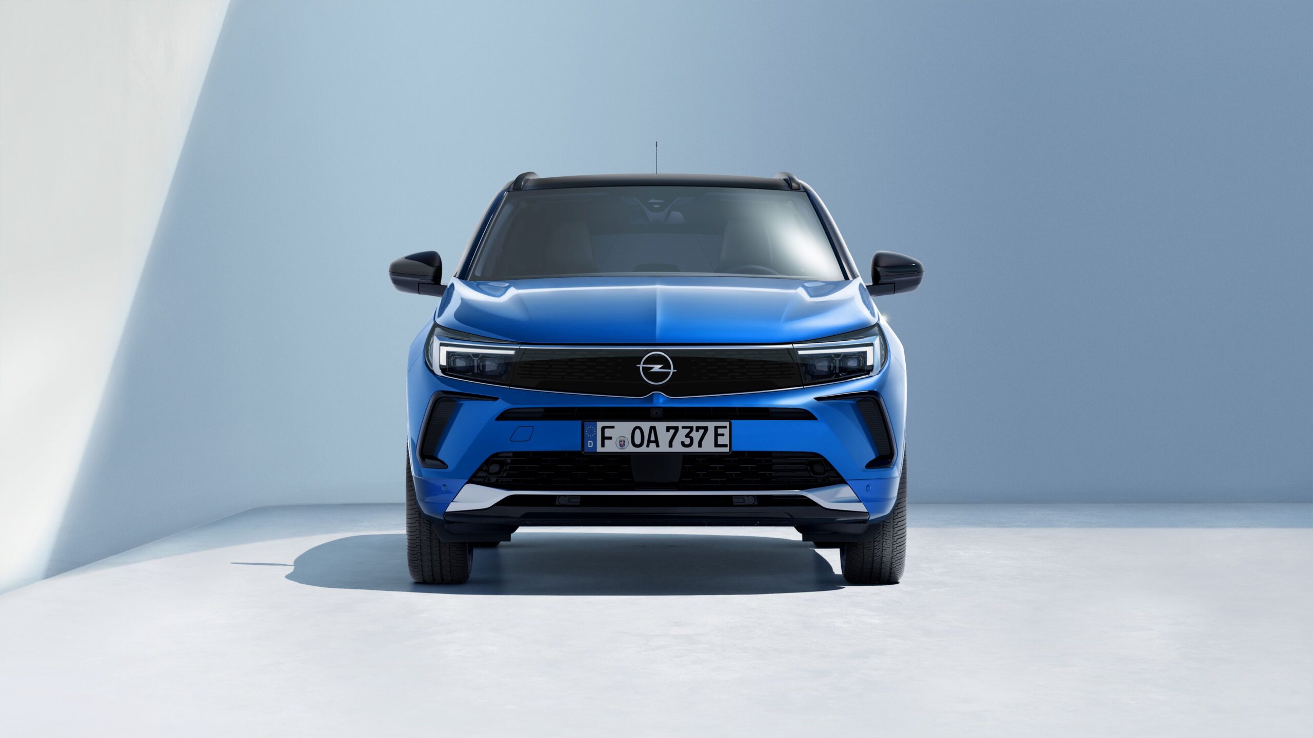
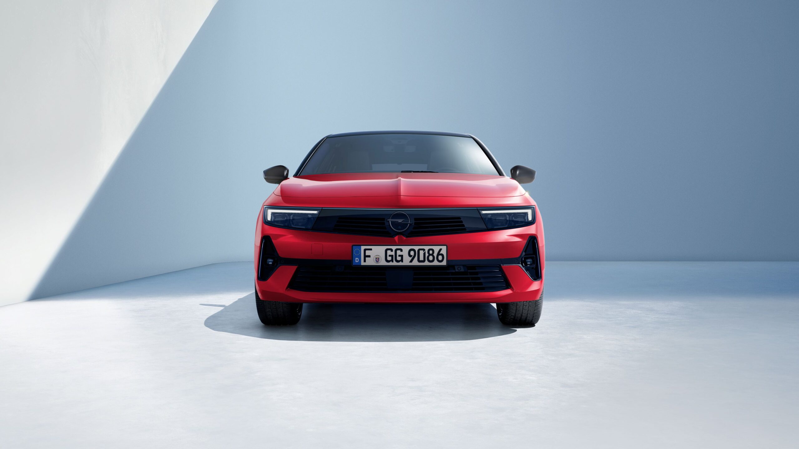
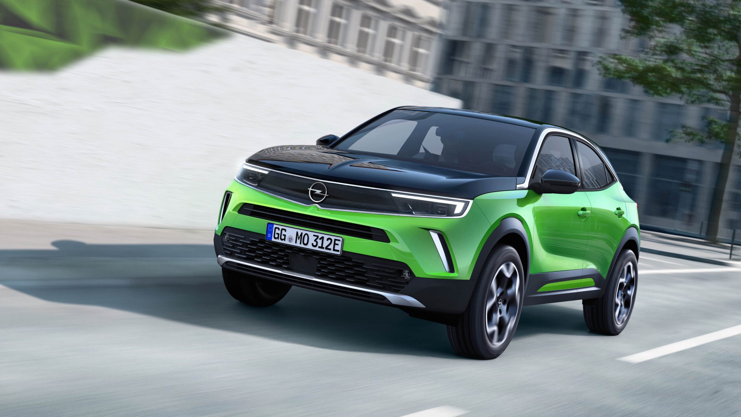
So in doing that and looking at the modern things, that’s how we came up with the Visor, because the Visor has a very simple graphic, it actually linked back to the Manta A which had a very similar graphic albeit it was very much a grille in those days with simple round lamps. But the big difference and what made it the real modern twist is that I wanted to make sure that it was future proof. For example, as we go for more sensors on the car (radar, cameras or Lidar) when you look at more modern cars today they’re peppered with sensors and they’re all different shapes all over the front of the car. And our ideal vision was, let’s corral them into a sort of tech hub, and that became the Visor.
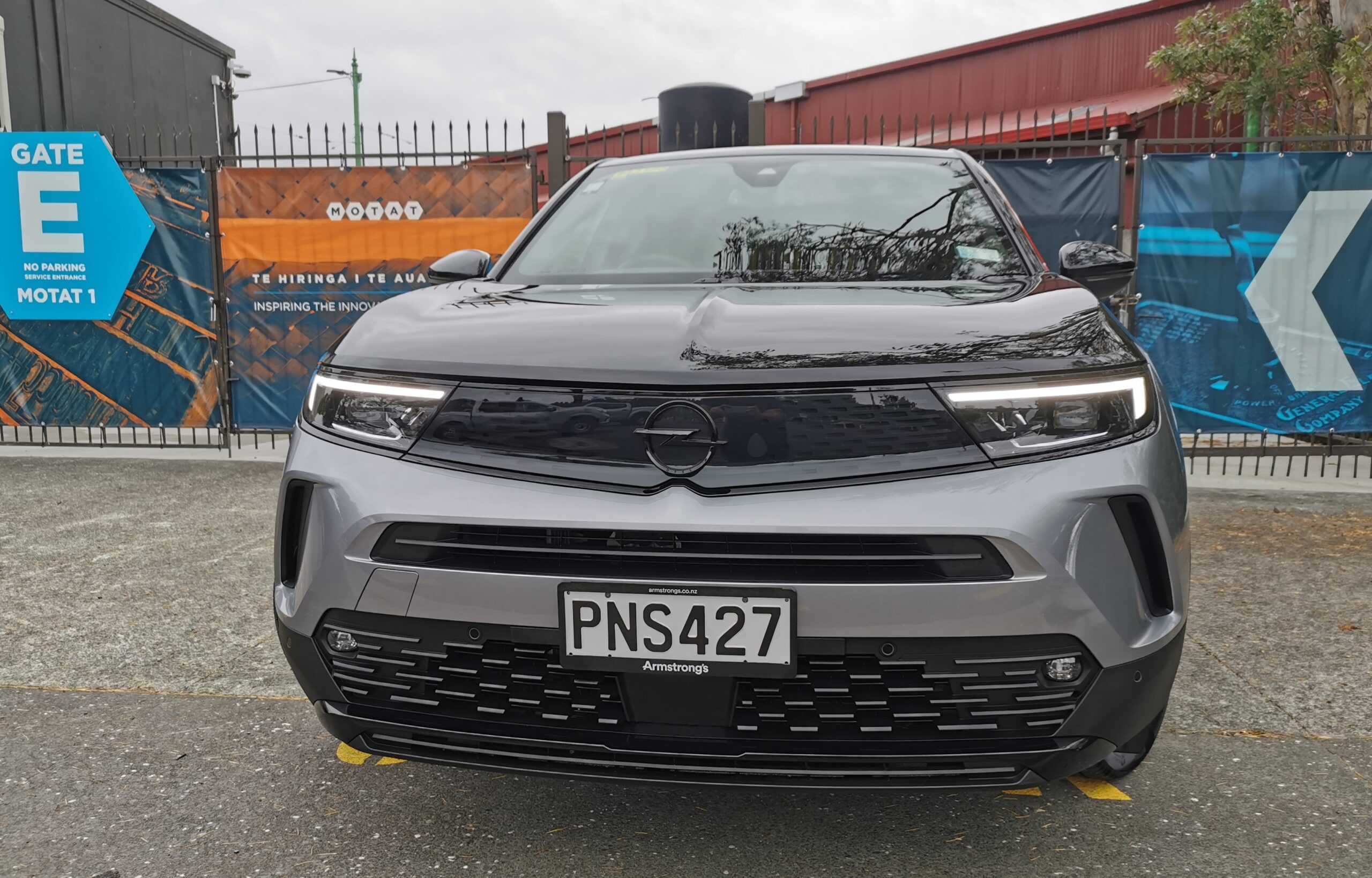
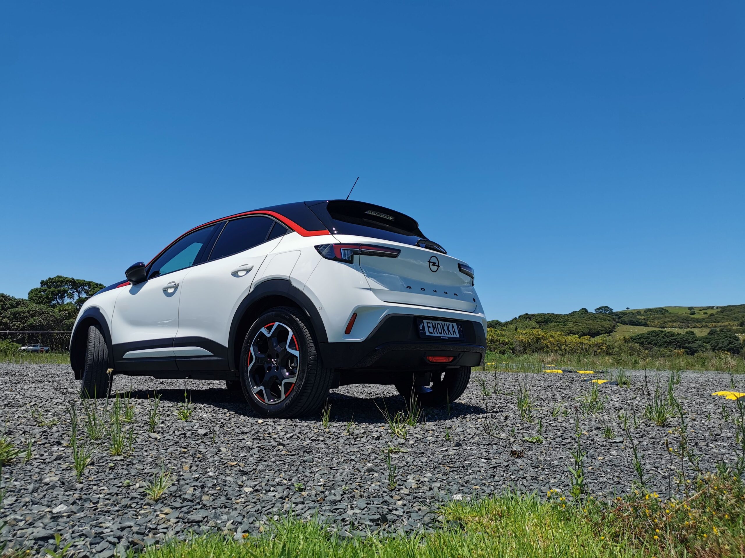
We can’t bring all those sensors into the first cars but that was our vision why the Mokka for example has this super clean almost glasslike look across the front. So we were thinking, how do we integrate and make everything on the front end of our cars very pure but at the same time, very distinctive, And I hope you’ll agree that what we’ve come up with on the face of our cars has definitely got those values, the shapes, forms, graphics and proportions are very strong making it bold but at the same time, the shapes are very controlled. They’re built around function, so the blisters on the Astra and the Mokka are to emphasis the driving characteristics of the cars, a visual purpose to communicate driving dynamics, Every shape we put on is there for a reason, to make the car look athletic and muscular but without having hundreds of lines all over the car.
How much focus was put on aerodynamics?
A German product and especially a German car has to have great functionality and I would say that part of that functionality is aerodynamic performance because efficiency is key. Particularly as we go to more and more electrified vehicles, range is impacted significantly by aerodynamics and so that was a key part of our design execution. The cars had very tough aerodynamic targets but we do a lot of detail work in the wind tunnel and a lot of the fine tuning brings about the last 10% of efficiency. So the design doesn’t change but the pulling and pushing of edges and surfaces really makes a difference.
A little example would be at the rear of our cars, the rear corners have a real flowing shape but when you look closely at the tail lamps they have a really hard separation edge and the radii on our bumpers is done to create a separation edge for the aerodynamics. And at the same for the back end of the ‘c or d’ pillars, more separation for aerodynamics. They’re not first glance things because the car has a more fluid and holistic feel but up close you start to see all these technical edges that have been developed for aerodynamics. So great German design blends exciting design with true German function.
It’s all about our experience, we know generally what you have to do. Sometimes you can put a shape into the wind tunnel and it can be terrible but most people would not notice the big difference between what went into the tunnel first and the final production car. We’ve massaged surfaces and created edges to optimise it but the design doesn’t really look any different. It’s all about experience, skill, refinement and interactive work. It is a bit of a black art, you think you know a shape but you don’t know how to present it until it’s been massaged. You have to try things out and experiment.
There’s no chance of pop up headlamps coming back?
Well if you look at some of our new creations, thanks to LED’s they have a super slim headlamp package and that’s brought the hood of nose area right down low which helps aerodynamically and then the flow around the side of the car is very important as we keep the air attached to the front and make sure that the separation at the rear is done in the perfect position, to trick the air into thinking that the car is longer and more teardrop in shape.
There’s a compass theme to it too?
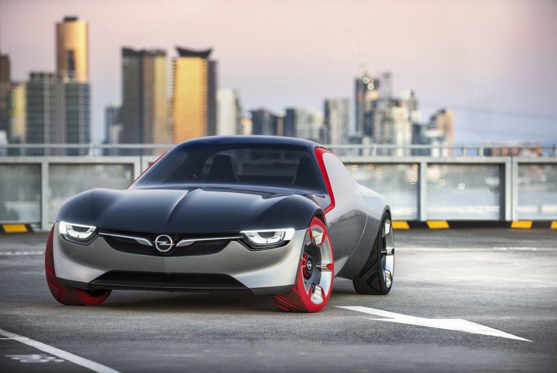
Going back to that time in 2017 when we redefined what we wanted to be, we created the GTX concept and if you look at that concept and the new production Mokka, it’s clearly the production execution of the GTX. And one of the things we talked about in the concept car was the idea of the compass. If you look at the front view of our cars, since the 1960’s we as a brand have always had a crease running down the centre of our cars. What we’ve done is exaggerated this and then the wing signature line, lines up with the emblem in the middle. So what you get is this vertical and horizontal elements meeting the emblem in the middle and we called that the compass. All of our cars basically have that signature. The proportions of the Visor and other things around it might change depending on the type of car it’s in but the basic framework is this compass. And there will be fresh interpretations of this as we move forward.
What are the future cars?
We have a clear portfolio and what we’ve done in the last year, we’ve already converted a lot of our cars to this new face and when the Astra comes that only leaves the Insignia and the Corsa. We don’t want to be predictable, we want things to be true to the brand but at the same time, move things forward. We’ve talked about the likes of the Manta but what we haven’t discussed is how that will be executed. Again, it shows how serious we are about bringing back these iconic cars into the future portfolio but with a modern twist.
Things go forward, customers’ tastes change, that’s why the SUV thing has been so huge and there will be another wave of change as electrification takes over going into the next decade. It’s a fantastic opportunity for all of us to move things on. But it’s got to be balanced with customer’s tastes, so it’s finding that sweet spot between taking the technologies forward but giving customers what they need. There’s a lot more to come and we’re very much on that leading edge.
The Mokka seems a lot more playful in terms of colour.
What we’ve done with the Mokka is very smart I think, because if you look at the number of colour choices we’ve actually reduced it down but what we have given people is a much more distinctive choice. With different colour and trim combinations and different models in the line up, we’ve reduced the complexity. So if you’re sportily inclined you’d go for the GS line trim. More brightwork and sophistication ‘Ultimate’ trim and so on. And that’s about making the customer experience much more pure.
The world has become too complex and we’ve said time out, enough’s enough, let’s simplify things for our customers but make it feel like it’s tailored towards them.
The communication car for the Mokka was green, Astra is yellow, so if they want a vibrant strong colour they can but if they want a grey or silver they can but we do it in a more distinctive, more unique way. We’re finding the right balance and we believe we’ve got something that fits the customer experience but not make it boring.
Who comes up with the colour names?
The people that come up with the names are largely my colour and trim team and they work with the marketing folk. Sometimes you can’t use names because someone else has a copyright. Much of that team is female and I feel that we are using that side of our diversity in a very progressive way. (Strangely the vibrant ‘matcha green’ Mokka is named after green tea which is supposed to make you calm and stress free).
What about the interior?
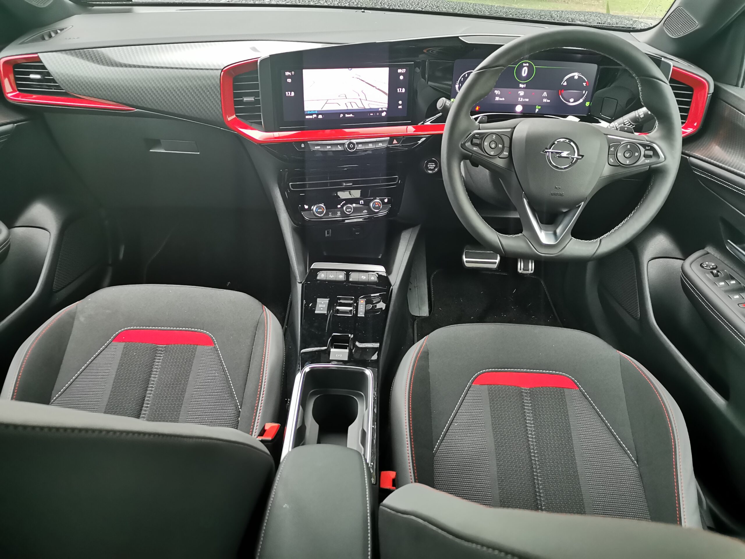
We wanted to bring the word pure again into our interiors. The pure panel in the new Astra for instance does give you this high tech interface but organised in a very logical way. So we’ve got a good combination of very clear and easy to understand graphics, the new HMI experience operates in a very clear and simple way.
My principle for the interior was ‘the world is over complex’, people are bombarded with things on the internet, on their phones, whether it’s emails or social media, we’re just over-burdened with electronics. And what we wanted to do was to simplify things, so when you sat in our cars the experience was much more pure.
Even down to the graphics and how they work, the clarity and how things are laid out on the screen was all about making things more simple. We still have physical buttons for things like volume or heating and the reason for that is we wanted you to be able to get at them quickly, not buried in the third layer of a screen that means you take your eyes off the road.
That’s fine with your phone because you can give 100% of your attention, but when you’re driving, our philosophy was ‘hands on the wheel, eyes on the road’ and take your eyes off the road for the minimum amount of time to operate something.
All of these details have been very carefully thought through.
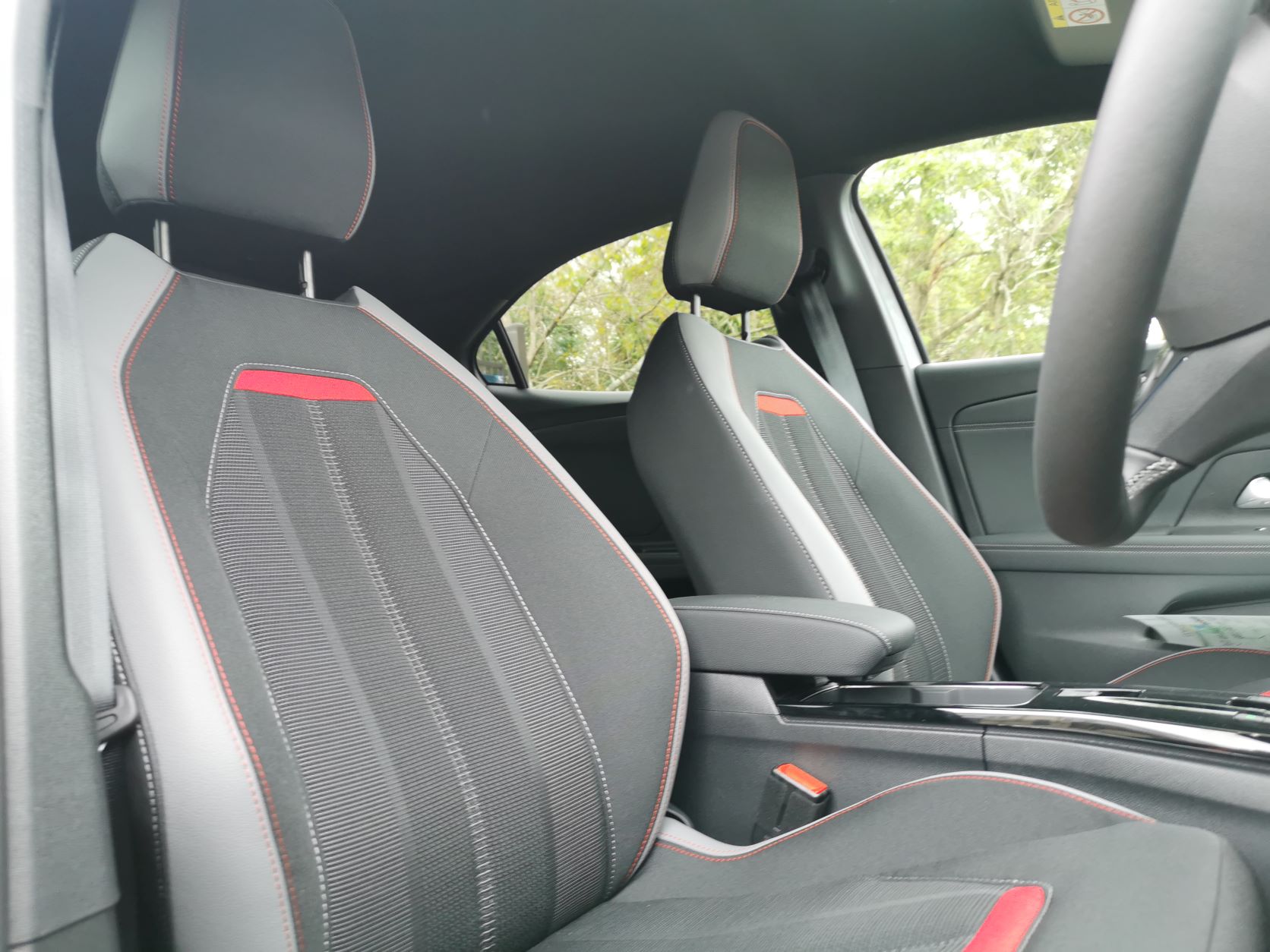
A simple level of detail that shows the level of care we took, is that we have two lots of switches under the main central screen. There’s a set of switches at the front for home and HVAC at the back, and in the middle of that area is a textured area to rest your thumb and it’s illuminated, so even at night it’s easy to find. Just resting your thumb makes the operation of the screen that much easier. More relaxed, more pure and less stressful. And we have voice control and head up displays too.
Even the positioning of screens, the horizontal landscape of central cluster and centre screen being higher and at the same basic distance from your face means that eyes don’t have to refocus, again part of making the experience more relaxed.
The interior is very important as it’s where you’ll spend most of your time. And the whole philosophy of bold and pure works all the way through. We bring everything back to ‘does it fit with our philosophy’ and if it doesn’t then we put a question mark next to it.
The future – Autonomy and single driving pods?
Transportation needs in different circumstances, whether it’s city, urban or rural we do see future opportunities in that space for sure. Then there’s the autonomous side (level 5) being just pods getting you from A-B with no emotional connection to what gets you there. But there are levels below that that can give you the benefit of full hands-free autonomy but not all the time. So when you want to be engaged in the driving process you can. I do see that coming but the timing and infrastructure required is massive. And there’s a cost involved too, not all our customers can afford massive expensive amounts of autonomy integrated into their car and maybe they don’t want to either.
So we have to play a careful, long term view. Do we buy into it, yes we do. But can we commit that everything will be in place by 2025, no we can’t because there are so many outside influences. We are in the fortunate position where we are one of the largest companies in the world now and being part of the group gives us the benefit of investing in future technologies that can be leveraged across all the brands.
But for Opel, what we do as a brand is we decide what things are relevant for our brand, in our market segments, for our customers. We can be targeted and specific for our customers.
Finally, of all the cars ever made, (aside from any Opels) are there any that you’d have loved to have designed?
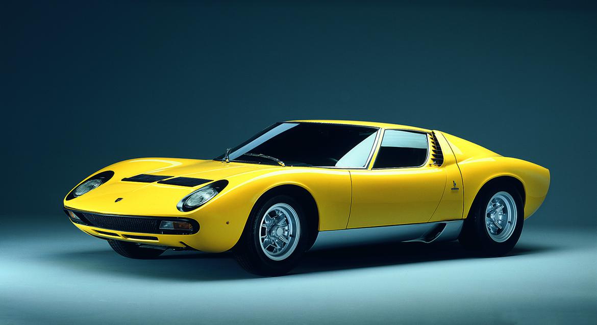
One of my favourite cars of all time was the Lamborghini Miura. Gandini got there first and he did it probably at the time I was born, but it’s those sorts of vehicles that actually inspired me into being a car designer. When I did get old enough and started to get an interest in cars, I combined my passion for drawing and cars. I’m very fortunate to be in a job that is a lot more than a job.