As more brands start to plan out their electric future, they tend to look to their past for inspiration. Be it model names, monikers, logos and the lot, we are seeing a renaissance of sorts in the car industry! French manufacturer Citroen has now become the latest entrant into this club.
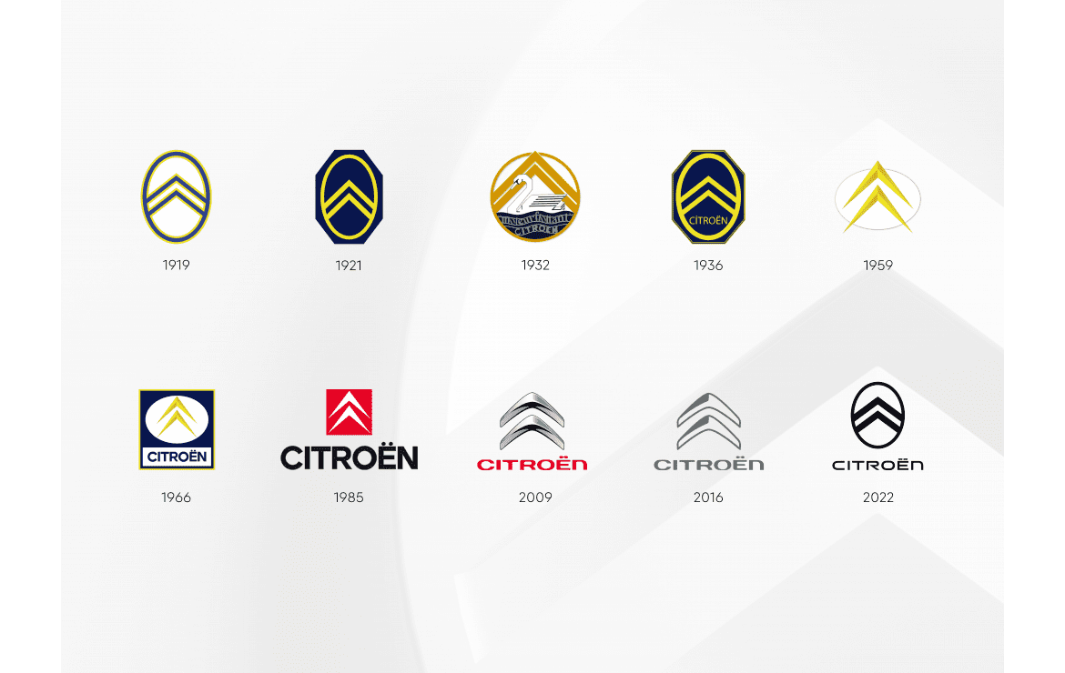
The brand new logo sees a revival of the original 1919 oval and forms the 10th evolution of the brand’s logo over its 103 year history! We will start to see this fresh logo on concepts next year and from then on, it will adorn the company’s promotional material and the cars of course. The refresh doesn’t stop with the logo as the corporate identity and slogan have also undergone changes. “Nothing Moves Us Like Citroen” is the new tagline.
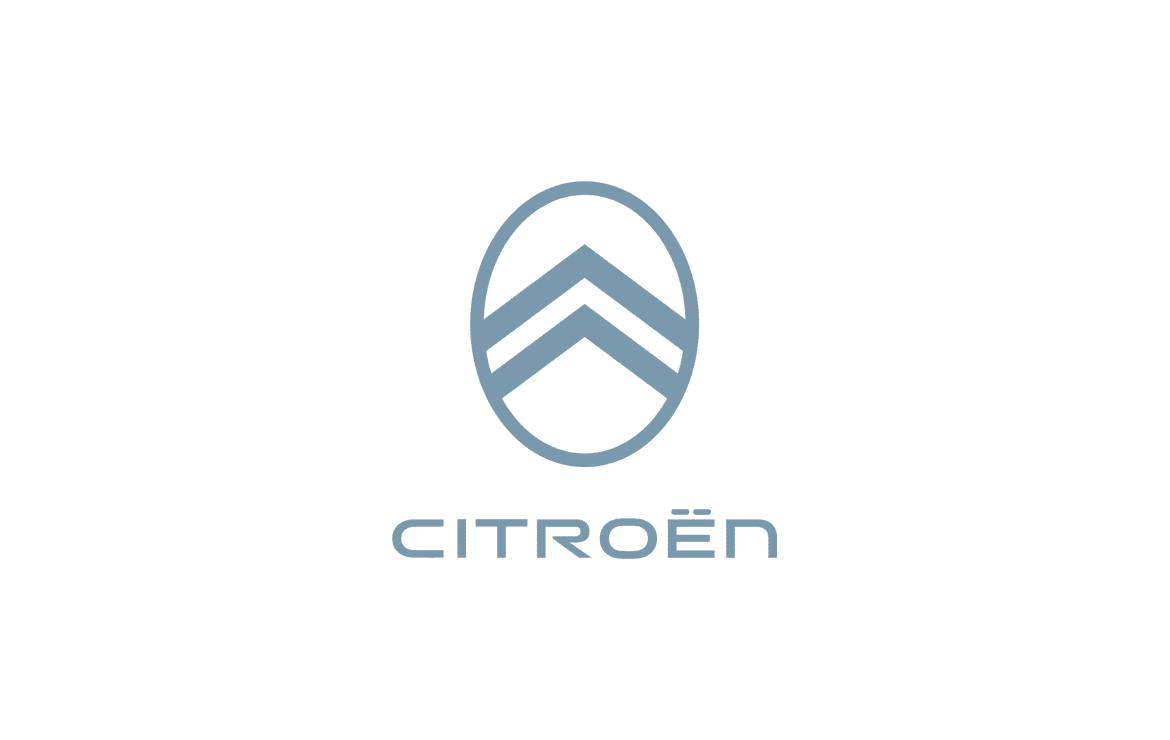
Andre Citroen’s original “deux chevrons” still remain an integral part of the brand with the chevrons having grown wider and more pronounced against a softer oval frame. Citroen’s team took learnings from the cosmetics and apparel industries to create a brand image that could go beyond the automotive industry. A key focus of which is the digital experience that customers will have with the brand.
On another note, Citroen will drop chrome from their products to help with recyclability but all is not lost because they are reviving the famous ‘Monte Carlo Blue’ from the 2CV and DS of yesteryear!
Thanks for reading! For more Citroen news and reviews, visit Tarmac Life.
Words by Matthew D’Souza, pictures courtesy of Stellantis Media.