Hold onto your tweed caps, because Bentley, the grand old dame of British motoring, has done the unthinkable. No, they haven’t fitted a hatchback to the Continental GT. They’ve changed the logo. In the notoriously slow-moving world of century-old luxury brands, fiddling with the crown jewels is the equivalent of a corporate earthquake, and this is only the fifth time they’ve dared to do it in 106 years.
This isn’t just some marketing intern getting ambitious with Adobe Illustrator. This new “Winged B” emblem is the very first signal of a “design and brand revolution” bubbling away in Crewe. It’s the flashy opening act for a new concept car set to be unveiled on July 8th, which will preview a whole new design language for the brand.
So What’s New, Exactly?
Under the guidance of Design Director Robin Page, the new emblem has been on a serious fitness kick. It’s sharper, more dramatic, and looks less like a gentle dove and more like a “Peregrine Falcon” diving for its dinner. The soft, puffy lower feathers have been completely binned for a cleaner, more aggressive silhouette.
The central ‘B’ has also had a major glow-up. Dubbed the ‘centre jewel’, it’s been redesigned with inspiration from high-end watchmaking, featuring a “bevelled glass edge and chamfered metal surround”. It’s so posh it can now stand alone as a logo, you know, for when the full wings are just a bit too much. The whole point, according to Page, was an exercise in “simplification and refinement” to create something “cleaner, sharper and more impactful” for our complex digital age.
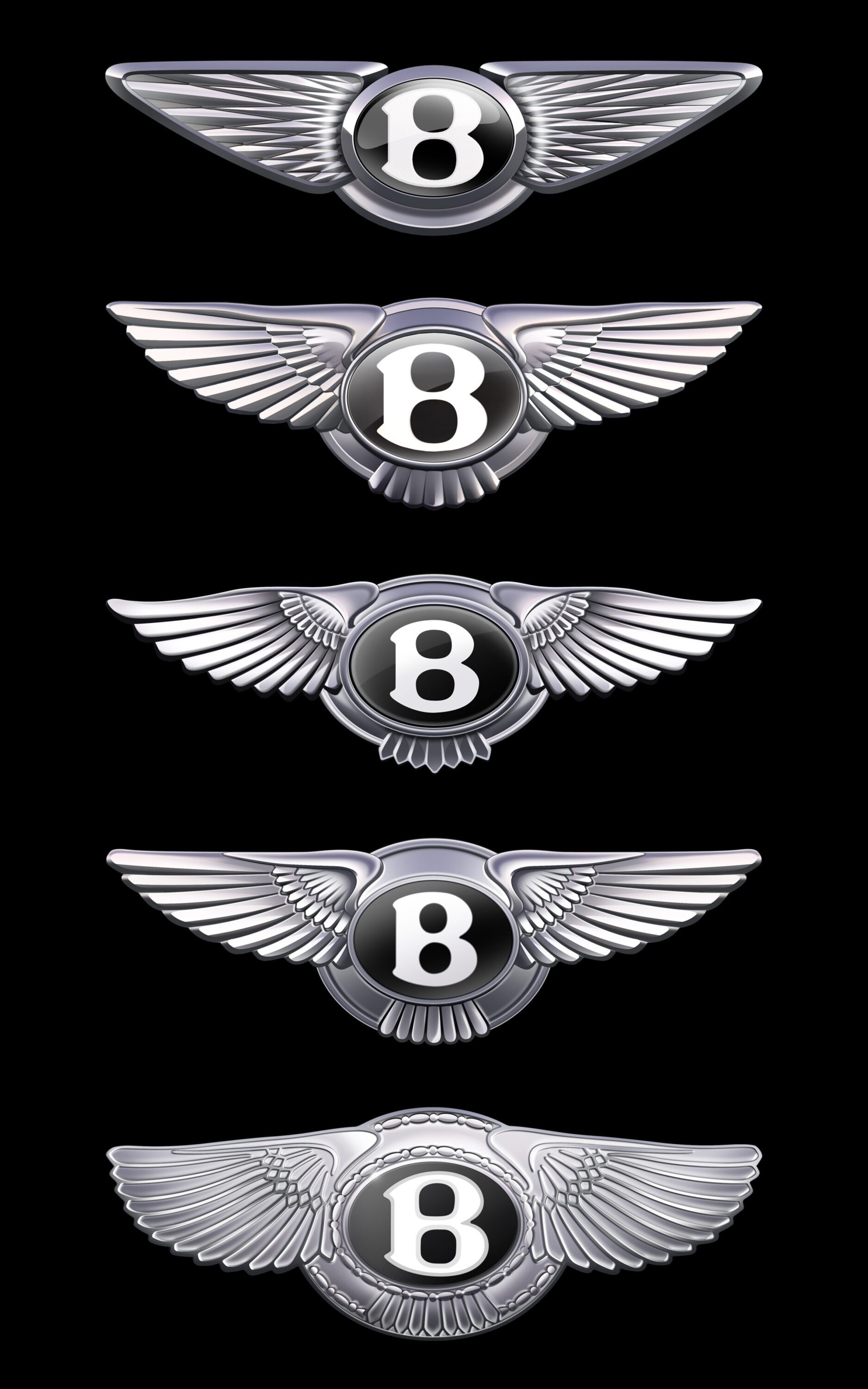
A Quick Trip Through Badge History
- 1919: The original was penned by famed motoring artist F. Gordon Crosby. He gave each wing a different number of feathers, a clever pre-war anti-counterfeiting trick. It was meant to evoke the exhilaration of motion and W.O. Bentley’s history with WWI fighter plane engines.
- 1931: Rolls-Royce takes over and things get a bit more… corporate. The wings become symmetrical and straightened, flanking a much simpler ‘B’. This rather sedate version was the longest-serving in the company’s history.
- c. 1996 – 2002: As VW Group prepared to take the reins and launch the game-changing Continental GT, the emblem was revisited. The designers brought back the asymmetrical feather count (10 on the left, 11 on the right) as a tribute to Crosby’s original design, ready for an era that would see production jump from 1,000 to 10,000 cars a year.
What’s the Point of All This?
This facelift for the Flying B isn’t just for show. It heralds a new era for Bentley, which is currently pursuing its ‘Beyond100+’ strategy to become an exclusively electric brand by 2035. The new emblem will make its official debut on July 8th, bolted to the front of a new concept car. While Bentley insists this concept isn’t destined for production, it will give a major “hint of the direction in which Robin will be leading Bentley design” for future models.
So, is it better? That’s for the internet and Bentley’s well-heeled clientele to argue over. But for a 106-year-old institution, changing the family crest is a bold statement. The wings are clipped, sharpened, and ready for a silent, electric future. We’ll be watching on July 8th to see if the car lives up to the promise of its shiny new badge.